Mobile app
Blissbond
Blissbond
Revolutionising the experience of outdoor weddings
Revolutionising the experience of outdoor weddings
My Role
My Role
Product Design
User research
Product Lead
Product Design
User research
Product Lead
Tools
Tools
Figma (design)
Notion (Documentation)
Figma
Notion
Figma (design)
Notion
Duration
Duration
August- Sept
2021
August- Sept
2021
The Product
The Product
The Product
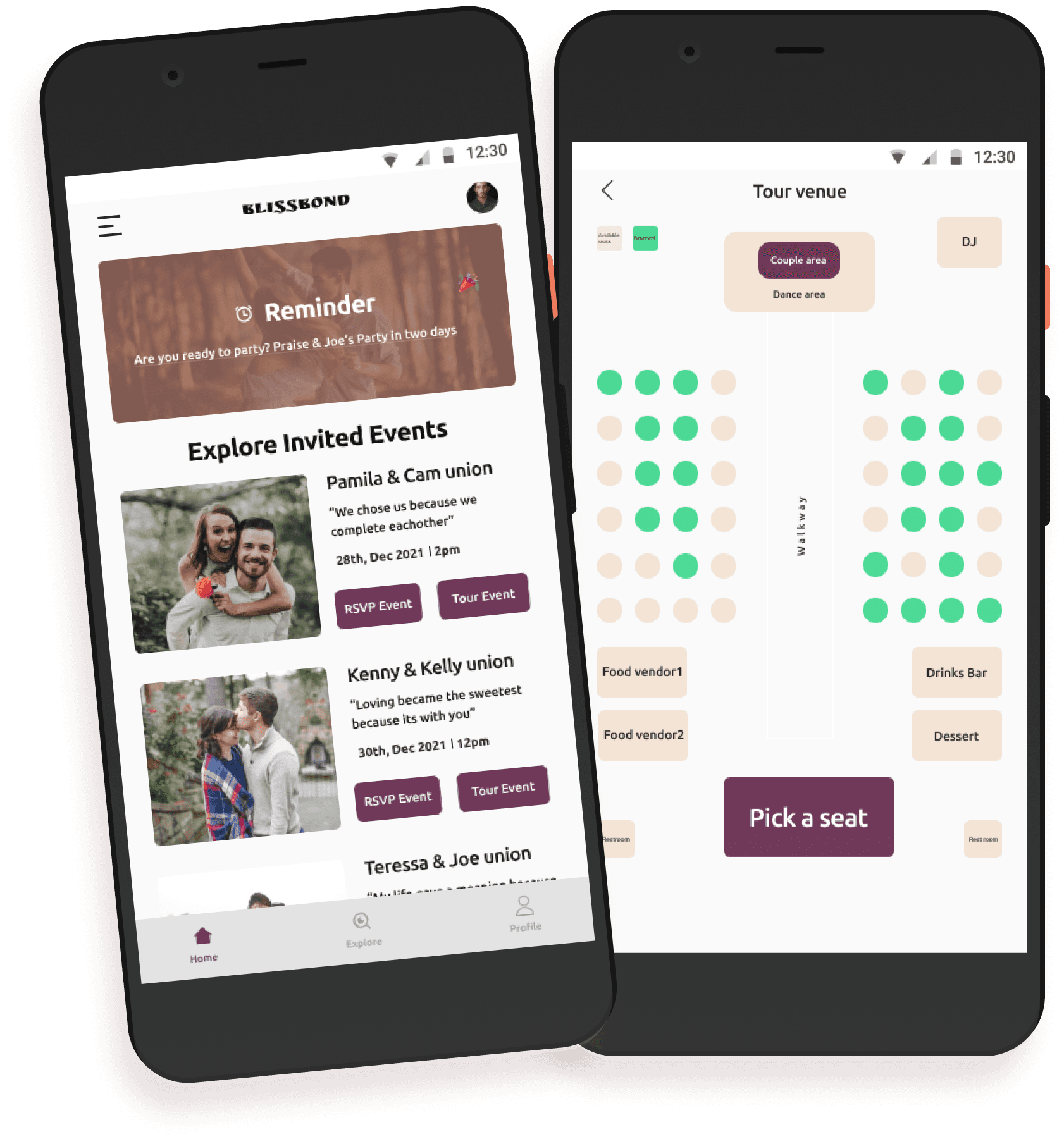
Blissbond is an innovative platform that aims to revolutionize the experience of outdoor weddings. The platform is designed to assist guests in navigating the venue effortlessly so they can fully enjoy the wedding ceremony and reception without any confusion or stress. With Blissbond, guests can easily access maps of the venue, including the location of the ceremony, reception, restroom facilities, and parking. Additionally, the platform offers helpful information on the wedding couple, including their story, photos, and registry. Blissbond also provides a messaging feature that allows guests to communicate with each other. This feature can be especially useful for guests who are attending the wedding alone, as it allows them to connect with others and make new friends. Overall, Blissbond is a powerful tool that can enhance the wedding experience for guests and planners, making it more enjoyable and memorable.
Blissbond is an innovative platform that aims to revolutionize the experience of outdoor weddings. The platform is designed to assist guests in navigating the venue effortlessly so they can fully enjoy the wedding ceremony and reception without any confusion or stress. With Blissbond, guests can easily access maps of the venue, including the location of the ceremony, reception, restroom facilities, and parking. Additionally, the platform offers helpful information on the wedding couple, including their story, photos, and registry. Blissbond also provides a messaging feature that allows guests to communicate with each other. This feature can be especially useful for guests who are attending the wedding alone, as it allows them to connect with others and make new friends. Overall, Blissbond is a powerful tool that can enhance the wedding experience for guests and planners, making it more enjoyable and memorable.
The Problem
The Problem
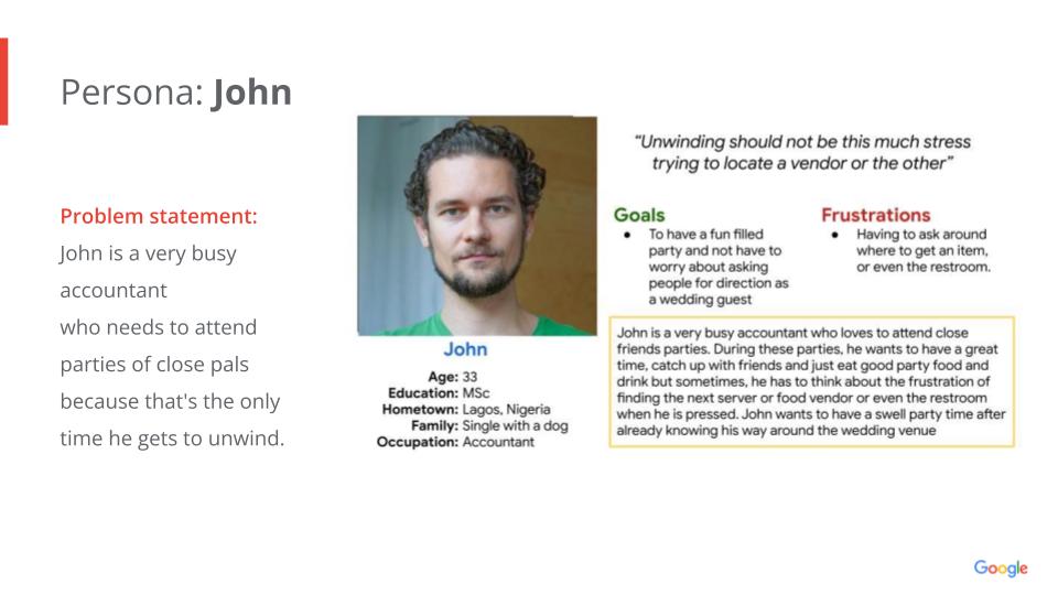
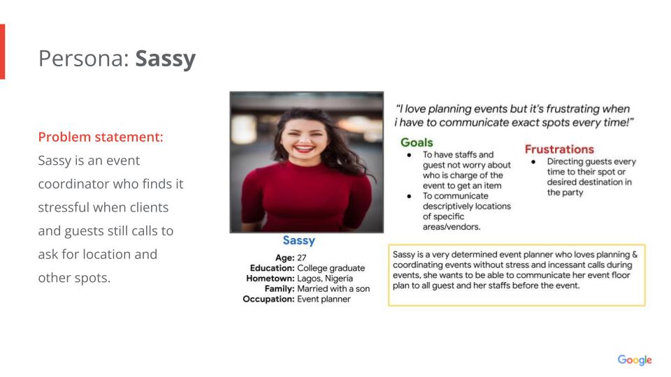
Party guests and planners frequently encounter significant challenges related to location and event coordination. Guests often struggle to find the venue of important vendors or even locate their assigned seats. On the other hand, planners find themselves inundated with numerous calls for directions from both guests and vendors, causing unnecessary stress and disruptions
Party guests and planners frequently encounter significant challenges related to location and event coordination. Guests often struggle to find the venue of important vendors or even locate their assigned seats. On the other hand, planners find themselves inundated with numerous calls for directions from both guests and vendors, causing unnecessary stress and disruptions
The Goal
The Goal
The primary goal of Blissbond is to make navigating a wedding venue a seamless and hassle-free experience for both guests and planners.
The primary goal of Blissbond is to make navigating a wedding venue a seamless and hassle-free experience for both guests and planners.
Understanding The Users
Understanding The Users
User Research
User Research
In order to understand the challenges and needs of the target users, I conducted interviews and created empathy maps. These interviews helped me gain insights into the experiences and perspectives of the product's target demographic. After carefully screening the participants, I conducted user research through video calls on the Telegram platform.
Upon analyzing the findings from the research interviews and comparing them to the assumptions regarding navigating wedding venues, it became evident that 80% of the interviewees had encountered difficulties in navigating wedding venues at least once. For this project, I interviewed a total of six participants, with three representing party guests and the remaining three representing party coordinators/planners.
Pain Points
Pain Points
Pain Points
During the user research, several pain points were identified based on the feedback from participants. Here are the key pain points identified:
Setting reminders: Participants expressed the need to set reminders for events they have RSVP'd to. They often struggle with remembering the exact date and time of the event and would like a feature that allows them to set reminders within the same platform. This would help them stay organised and ensure they don't miss important events.
Virtual tour of the event: Participants mentioned that they would appreciate a platform that offers a virtual tour of the event location. This would help them familiarize themselves with the venue layout and choose their seats in advance. Having a visual representation of the venue would enhance their overall experience and make them feel more prepared.
Explore location: Participants expressed a desire for a platform that provides information about nearby hotels, pubs, and other amenities around the event location. They mentioned that sometimes they would like to extend their stay or have a drink before heading home, and having recommendations for nearby establishments would be valuable to them.
Event locator: Participants found it cumbersome to copy and paste the event address into navigation apps. They expressed a preference for a platform that either directly connects them to a map or provides an integrated map feature that helps them navigate to the event venue more easily. This would save them time and effort in finding the location.
By addressing these pain points, Blissbond aims to provide a solution that simplifies the navigation and overall experience for wedding guests and event planners.
User Persona 1
User Persona 1

User Persona 2
User Persona 2

Information Architecture
Information Architecture

Understanding The Users
Understanding The Users
Paper Sketch
Paper Sketch
Paper Sketch
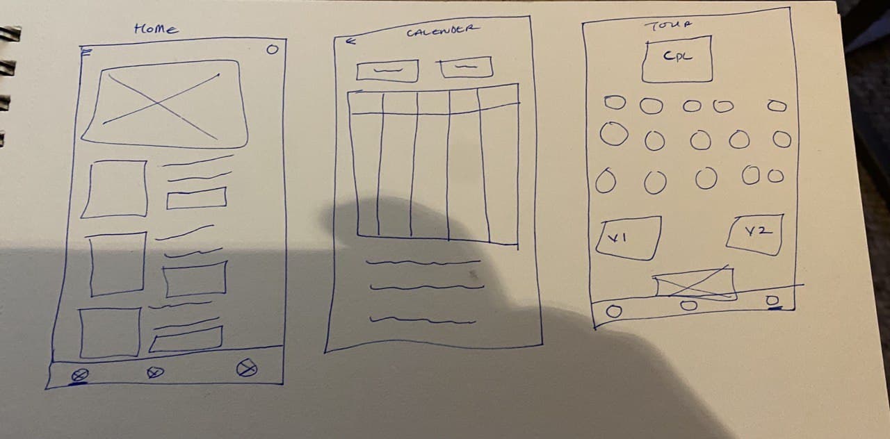
In the first stage of my design execution, I created rough sketches of the important screens of the proposed app on paper. These sketches allowed me visualize the layout and structure of the screens before translating them into digital wireframes. I ensured that the elements included in the digital wireframes were carefully selected to address user pain points effectively.
For example, on the home screen, I prioritised key features such as the RSVP and Tour options. This decision was made based on the identified pain points of users, aiming to provide them with a faster and more efficient way to navigate through the app and save time. By prominently displaying these options on the home screen, users can easily access the RSVP feature to confirm their attendance and the Tour feature to explore the event venue virtually.
By considering the user pain points and incorporating user-centric design principles into the wireframes, Blissbond aims to create an app that effectively addresses the needs and preferences of wedding guests and event planners, enhancing their overall experience and satisfaction.
Digital Wireframe sketch
Digital Wireframe sketch
Digital Wireframe sketch
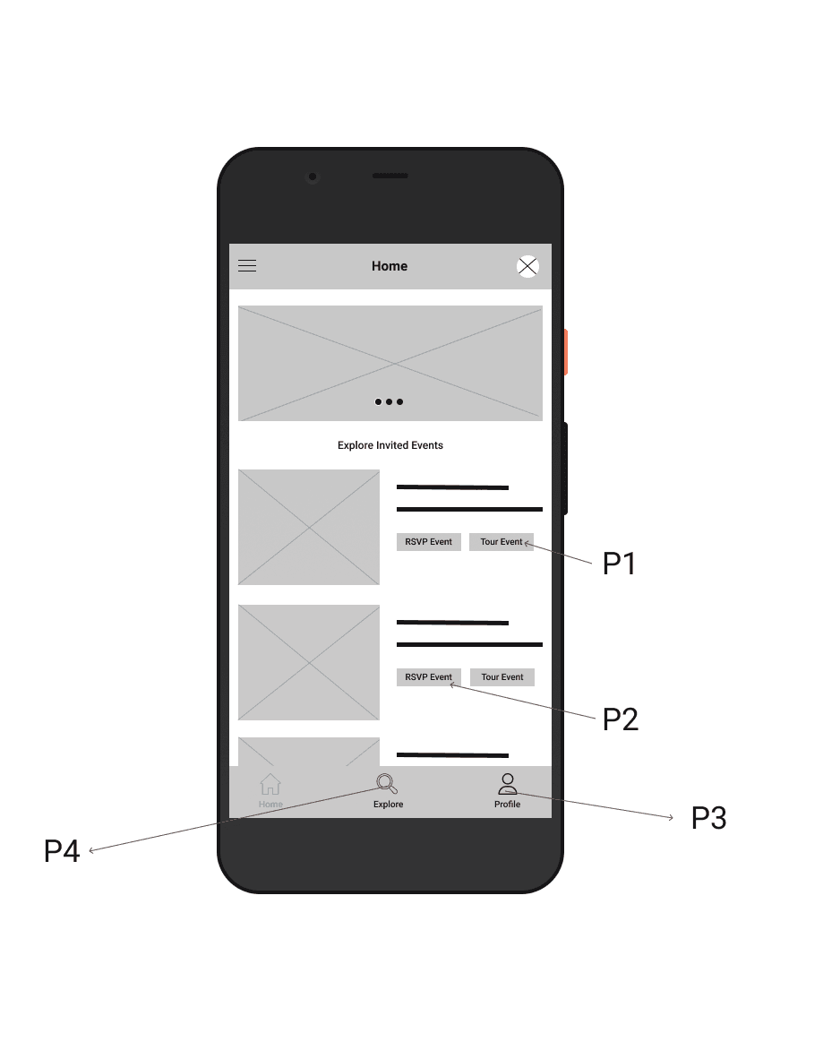
In this design phase, I created digital wireframes based on the feedback and findings gathered from the user research. These wireframes were carefully crafted to incorporate the desired features and address the pain points identified by the users. Here is an overview of the key screens and features:
P1: Home Screen: The home screen prominently features a button that allows users to directly access the event tour feature. This addresses the users' need for a quick and easy way to navigate the event venue. By placing it on the home screen, users can easily access the tour option without any additional steps.
P2: Add to Calendar: Users expressed the desire to have a feature that helps them add events to their calendar for better organization and reminders. This screen showcases the functionality that enables users to add the event to their calendar directly from the app.
P3 & P4: Navigation Buttons: These buttons provide easy access to the explore and profile pages from the home screen. Users can navigate to different sections of the app with a single tap, enhancing the overall user experience and making the app more intuitive to use.
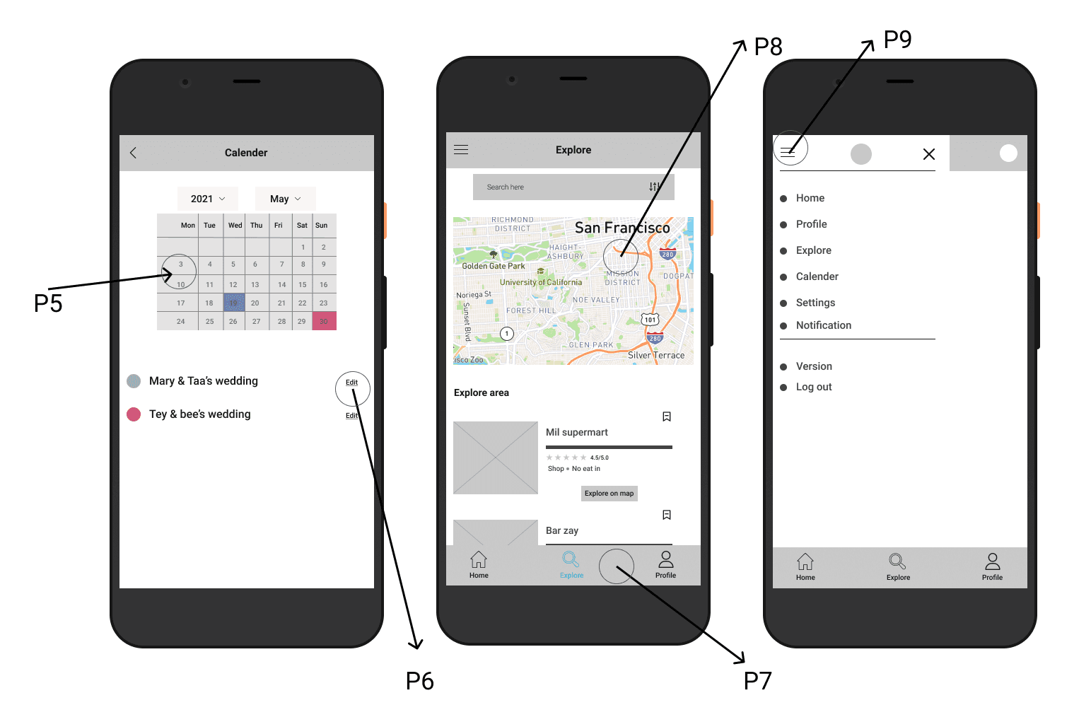
P5: Calendar Menu: This screen displays the calendar menu where users can view their added events. It provides options to add or delete events, and each event is visually represented with colors to help users easily distinguish between different events.
P6: Edit Event: Users have the ability to edit the details of their added events for better customization. This screen allows users to modify the event information, ensuring flexibility and convenience.
P7: Footer Navigation: The footer menu provides quick access to the home, explore, and profile pages from any screen within the app. This persistent navigation feature ensures easy and seamless navigation for users.
P8: Explore Page: This screen showcases the explore page, where users can see their current location on the map and explore nearby locations. Users have the option to search based on their preferences and can bookmark spots of interest for future reference.
P9: Side Menu: The side menu icon is included for improved readability and accessibility. Users can access different sections of the platform directly from the home page, enhancing the overall user experience and making it more user-friendly.
By translating the findings from user research into digital wireframes, Blissbond aims to create an intuitive and user-centric app that effectively addresses the pain points of party guests and planners, providing them with a seamless and enjoyable experience.use.
Low Fidelity Prototype
Low Fidelity Prototype
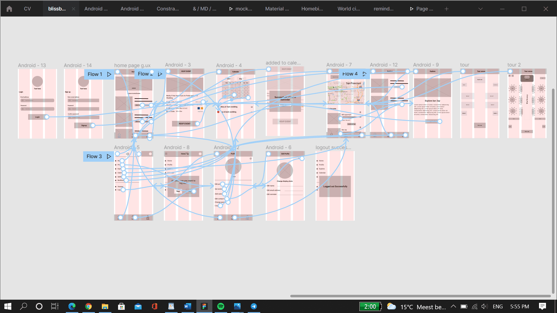
Using the completed set of digital wireframes, I developed a low-fidelity prototype. The focus of the prototype was on the primary user flow, which involved exploring the app, taking a tour of the event venue, and RSVPing for an event. This prototype was designed to be used in a usability study to gather feedback and evaluate the user experience.
The prototype was created with simplicity and functionality in mind, using basic interactive elements to simulate user interactions and transitions between screens. It allowed users to navigate through the app, view event details, access the event tour feature, and RSVP for an event.
During the usability study, participants were given specific tasks to complete using the prototype, such as exploring different event locations, taking a virtual tour of an event venue, and RSVPing for an event. Their interactions with the prototype were observed and recorded, and feedback was collected to identify any usability issues, pain points, or areas for improvement.
By testing the low-fidelity prototype with users, valuable insights were gathered to refine the design, enhance the user experience, and ensure that the final product meets the needs and expectations of the target users.
Overall, the low-fidelity prototype served as a valuable tool in the iterative design process, allowing for early feedback and validation of design decisions before proceeding to higher-fidelity prototypes and the final implementation of the Blissbond app
View Blissbond low-fi prototype here: Low-fi prototype
View Blissbond low-fi prototype here: Low-fi prototype
Usability Study
Usability Study
I conducted two rounds of usability studies. For these studies, i used this usability study plan. From this plan i went on to create an identification template to help classify these findings into descriptive themes. The Findings from the first study helped guide the designs from wireframes to mockups.
To showcase the changes made after the first study, a presentation deck was created, highlighting the design updates and explaining the rationale behind each modification. This deck provided a visual overview of the changes implemented from the low-fidelity prototype based on the findings of the initial usability study.
Summary of Findings:
The tour function that exists is not descriptive enough
Most users could not login the normal way
No prompt to tell if they reserved their spot successfully
Users are not sure if they are logged out or not.
Users want to be able to tell they have added an event to their calendar successfully
By incorporating user feedback from both rounds of usability testing, I was able to refine the designs, address usability issues, and enhance the overall user experience of the Blissbond app. The iterative nature of the design process ensured that user needs and pain points were effectively addressed, resulting in a more user-friendly and intuitive product.
Refining the Design
Refining the Design
Refining the Design
Mockups
Mockups
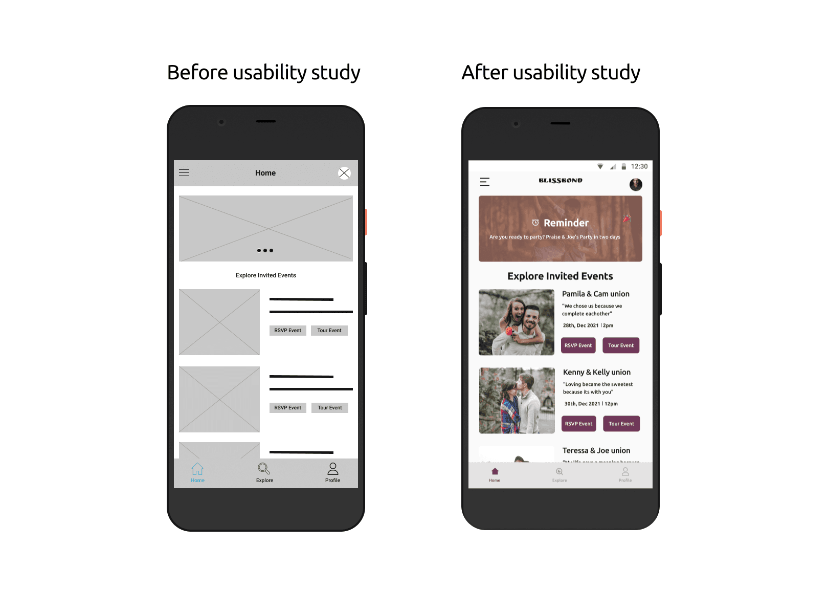
After conducting the usability studies, improvements were made based on the feedback received. One of the changes made was the addition of icons for accessibility. The first iteration designs had some level of customization, but the feedback from users highlighted the importance of incorporating clear visual cues for accessibility. By adding icons, users can easily identify and understand the functions and features of the app, improving the overall usability.
Another significant design revision was the implementation of visual indicators to indicate the user's current position within the app. For example, when users first land on the screen, a bright color is applied to the home icon, following the Google Design System standard. This design enhancement helps users quickly understand what part of the app they are on within the app's navigation hierarchy. By providing visual cues and highlighting the user's current position, the design promotes a more intuitive and seamless user experience.
These revisions were made based on the findings and recommendations from the usability studies. By incorporating user feedback and aligning with established design standards, the Blissbond app was enhanced to provide a more accessible and user-friendly interface.
As a result of the usability studies, two important prompts were added to the app to improve the user experience related to the login/logout functionality.
Firstly, a prompt was implemented to inform users that they have been logged out successfully. This prompt serves as a confirmation message, providing reassurance to the user that their logout action was successful. It helps prevent any confusion or uncertainty by explicitly stating that the user has been logged out of the app.
Secondly, a prompt was introduced to confirm if the user really wants to log out. This prompt acts as a safety measure to prevent accidental logouts and ensure that users are intentional in their decision to log out. By presenting a confirmation dialog, users have the opportunity to review their choice and make sure they want to proceed with the logout action.
These prompts were added to address specific pain points identified during the usability studies. By providing clear feedback and confirmation to users during the login/logout process, the app enhances transparency, reduces confusion, and helps users make informed decisions.
More Mockup screens
More Mockup screens
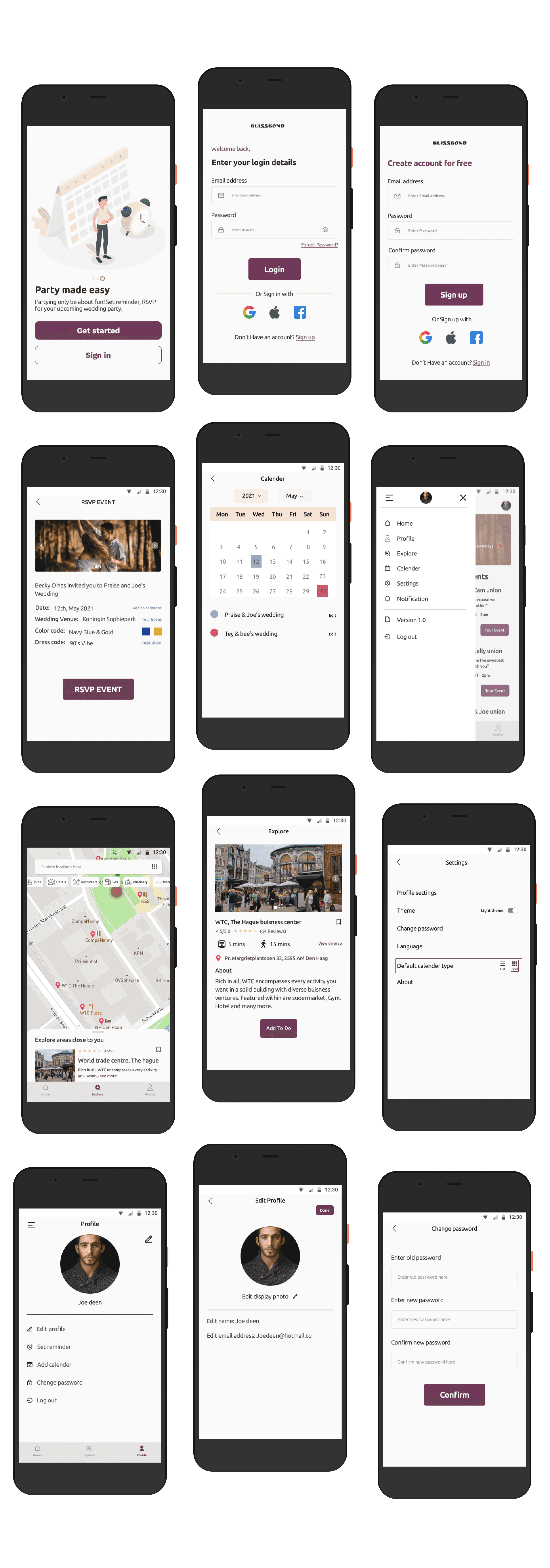
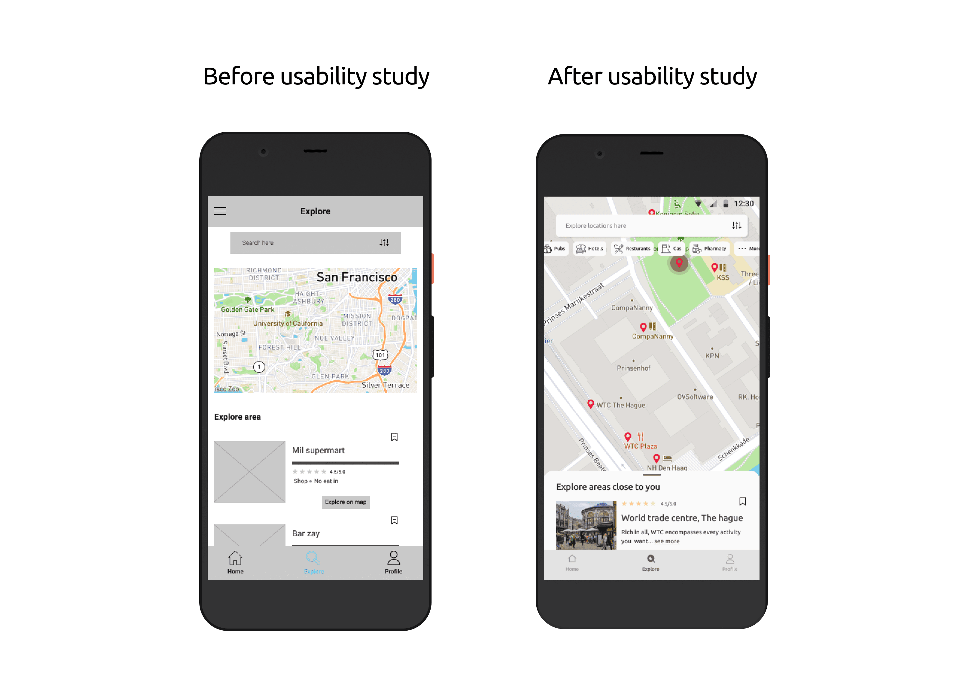
Overall the feedback from the usability studies helped identify the need for improvements in the explore screen, I focused on redesigning it to enhance usability and accessibility. some more changes were made:
Improved visual hierarchy: The visual elements on the explore screen were rearranged to create a clearer and more intuitive hierarchy. This helps users quickly understand the content and navigate through the page.
Enhanced search functionality: The search feature was refined to provide more accurate and relevant results. Users can now enter their preferred search criteria, such as location or category, and easily find the desired venues or points of interest.
Accessible design considerations: Accessibility features were incorporated into the explore screen design to ensure it is usable for all users. This includes considerations for color contrast, text size, and screen reader compatibility, among others. By adhering to accessibility guidelines, the app becomes more inclusive and usable for a wider range of users.
Clear location indicators: The map view on the explore screen now includes clear location indicators to help users identify their current position and nearby points of interest. This allows users to easily locate and navigate to different venues or areas within the map.
Overall, the redesign of the explore screen aims to provide a more user-friendly and accessible experience. By incorporating user feedback and implementing best design practices, the new explore screen offers improved functionality, ease of use, and better accessibility for all users.
High Fidelity Prototype
High Fidelity Prototype
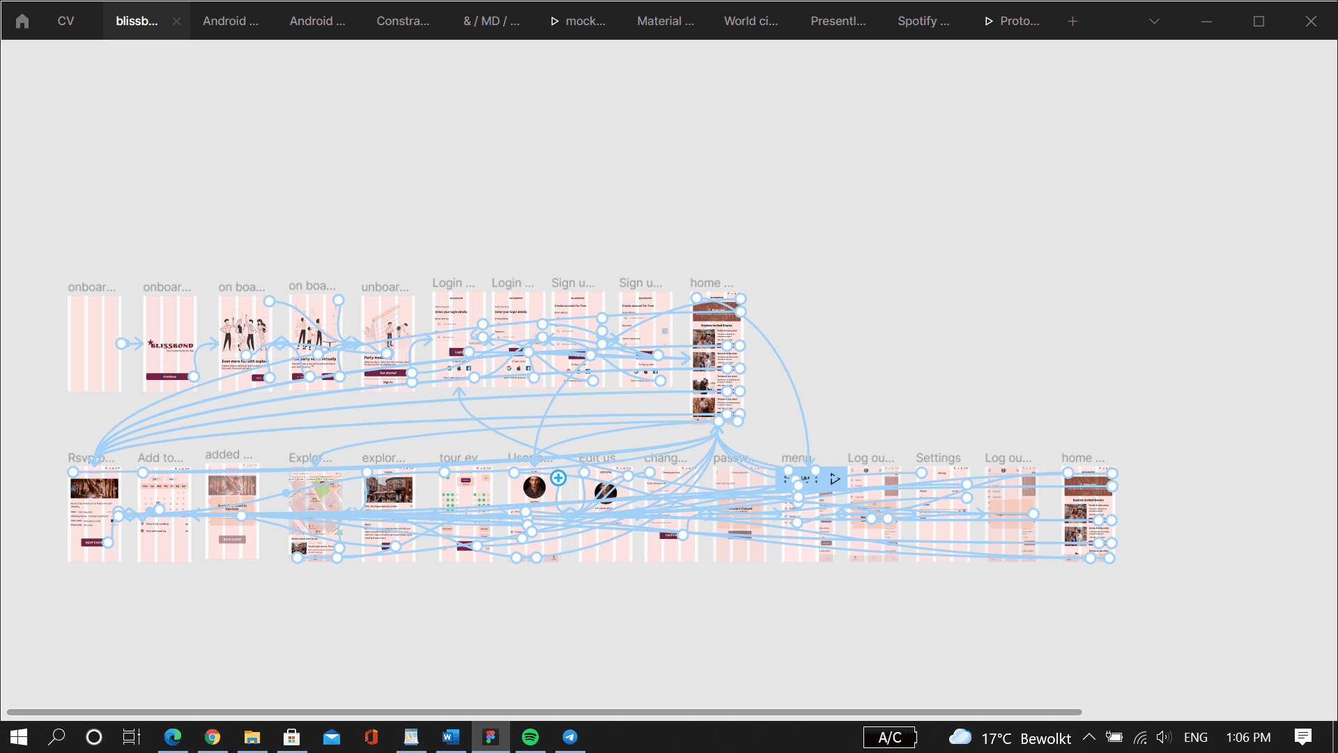
The final high-fidelity prototype reflects the iterative design process and incorporates the improvements based on user feedback. It presents cleaner user flows and addresses the pain points identified during the usability studies. Here are the key features and enhancements of the prototype:
Touring an outdoor event: The user flow for touring an event has been refined to provide a seamless experience. Users can easily access the tour feature from the home screen, allowing them to explore the event venue virtually. The design ensures that the tour is descriptive and engaging, providing users with a better understanding of the event location and layout.
Setting event reminders: To help users remember important events, the prototype includes a feature to set event reminders. Users can easily access this functionality and specify the exact day and time they want to receive a reminder. This feature enhances user engagement and ensures they stay informed about upcoming events.
Exploring close locations: The explore functionality has been improved to allow users to discover nearby venues, such as hotels and pubs. Users can search for specific categories or browse through a map view to find locations of interest. The prototype provides relevant information about each venue, helping users make informed decisions about where to go.
Quick prompts and feedback: The prototype includes quick prompts and feedback to provide users with instant confirmation and guidance. For example, users receive prompts indicating successful login/logout actions, successful addition of events to their calendar, and other important interactions. These prompts enhance user confidence and provide clear feedback on their actions.
By incorporating these enhancements into the high-fidelity prototype, the final design meets the needs of users for seamless event touring, reminder setting, and location exploration. It offers a cleaner and more intuitive user experience, addressing the pain points identified during the usability studies.
Check high-fi prototype here blissbond high-fi
Check high-fi prototype here blissbond high-fi
Accessibility Guideline Consideration
Accessibility Guideline Consideration

Check high-fi prototype here blissbond high-fi
Check high-fi prototype here blissbond high-fi
Going Forward
Going Forward
Impacts
Impacts
The Blissbond app has had a positive impact on users, making them feel heard, cared for, and addressing their needs effectively. Users have expressed satisfaction with the app's ability to help them navigate and enjoy parties without the usual challenges they face.
A quote from peer feedback highlights this sentiment, with a user expressing their excitement about the app's potential impact on their party experiences. The user emphasizes that locating essential facilities like toilets, food vendors, and seats can be challenging, but the app provides a solution to these needs. The user looks forward to the app coming live.
This feedback demonstrates that the Blissbond app has successfully addressed the pain points identified during the design process and has positively impacted users' party experiences. By providing features such as venue navigation, seat selection, event reminders, and exploration of nearby locations, the app has improved the overall usability and convenience for party guests and planners.
The app's success in meeting user needs and enhancing their party experiences indicates the effectiveness of the design process and the thoughtful implementation of user feedback and insights.
Lesson Learnt
Lesson Learnt
During the development of the BlissBond app, I gained valuable insights, particularly regarding the significance of user feedback in the design thinking process. Getting feedback from users proved to be the most critical stage as it allowed me to understand the target audience and effectively cater to their needs. It also played a crucial role in solving problems for diverse users. By conducting usability studies and seeking feedback, each iteration of Bliss Bond's design was influenced and improved, ensuring a user-centric and optimized experience.
During the development of the BlissBond app, I gained valuable insights, particularly regarding the significance of user feedback in the design thinking process. Getting feedback from users proved to be the most critical stage as it allowed me to understand the target audience and effectively cater to their needs. It also played a crucial role in solving problems for diverse users. By conducting usability studies and seeking feedback, each iteration of Bliss Bond's design was influenced and improved, ensuring a user-centric and optimized experience.
